Advertising.
Advertising was something I never I thought I’d love. From the day I was born, I had imagined myself as a painter or illustrator. Now, just seeing a well-executed advertisement puts an ear to ear grin on my face. The art of advertising is a combination of graphic design, typography, and photography, all to ensure the right consumer is both aware, and interested in the right product.
Advertising is a visual sales-pitch that needs to be eye-catching and informational. Exemplary advertising, however, needs to memorable.
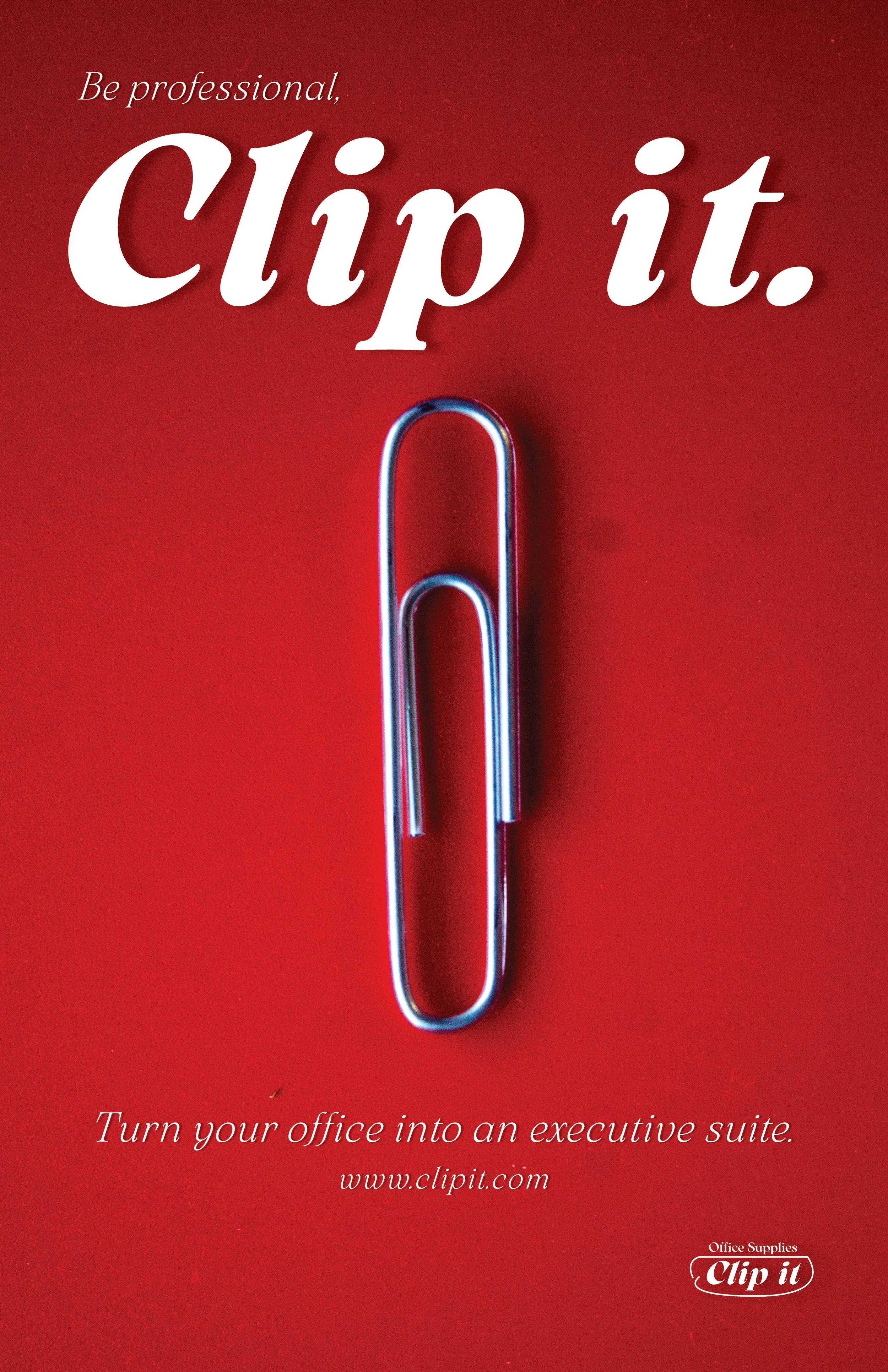
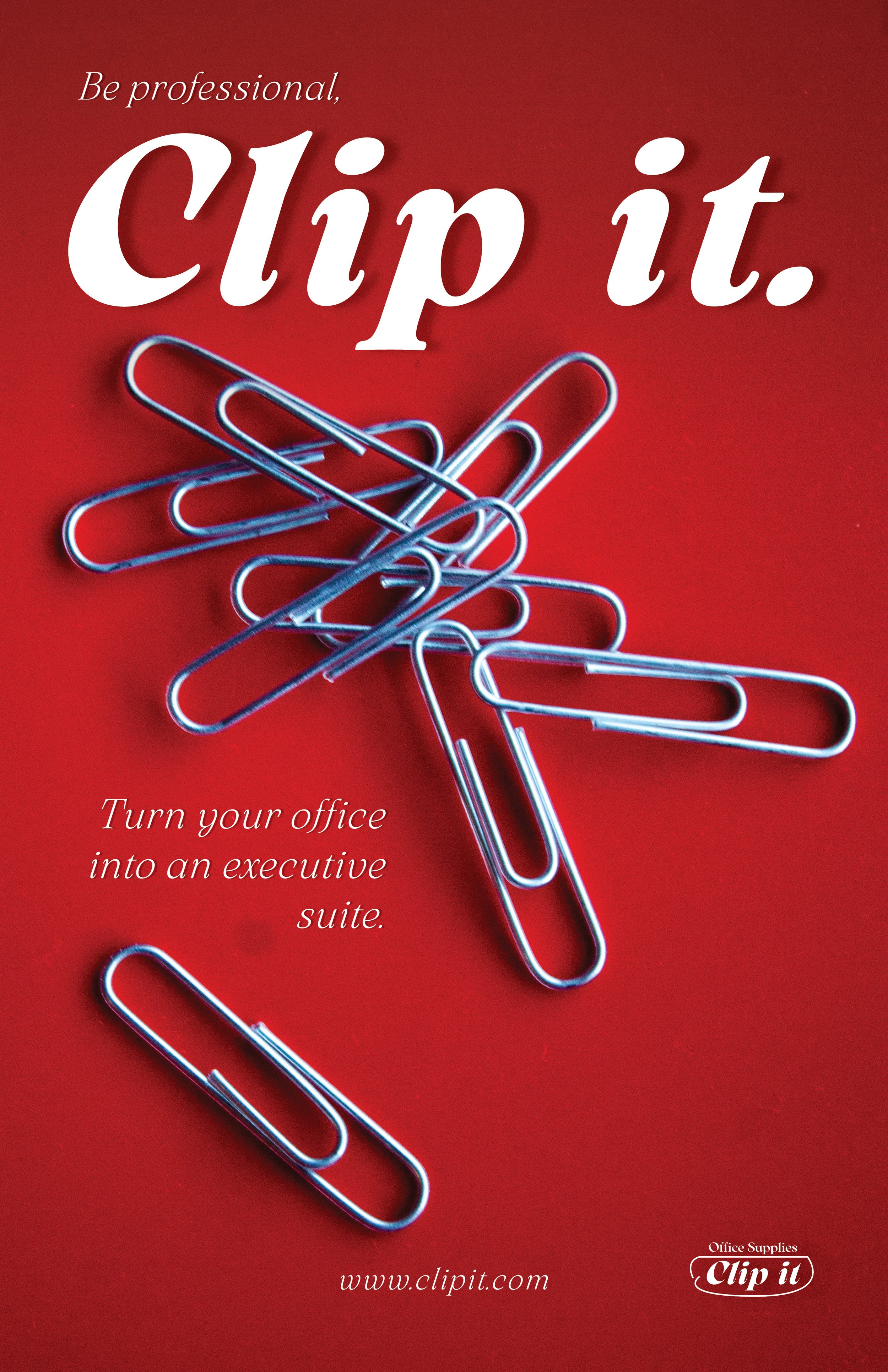
Clip it.
Assignment Prompt:
To create an advertisement for a basic household item that was given to us. I was assigned an ordinary paper clip.
The Concept:
Instead of selling the utilitarian benefits of a paper clip, like many of my peers assigned the same item, I wanted to sell the paper clip as a luxurious commodity.
There is a reason luxury brands like Rolex or Bugatti don’t often advertise. They don’t need to. If you don’t know the product, or what it does, then it’s probably not in your price range.
I sought to achieve this same idea of exclusivity, selling the paper clip as a “business secret” for upper management and successful entrepreneurs.
The Solution:
Taking inspiration from brands like Cadillac and Christian Louboutin, I knew I wanted a rich, red color scheme to create a sense of authority and regality. In addition, the serif typeface, Arsenica, further instates the conservative, “old money” aesthetic.
Assignment Prompt:
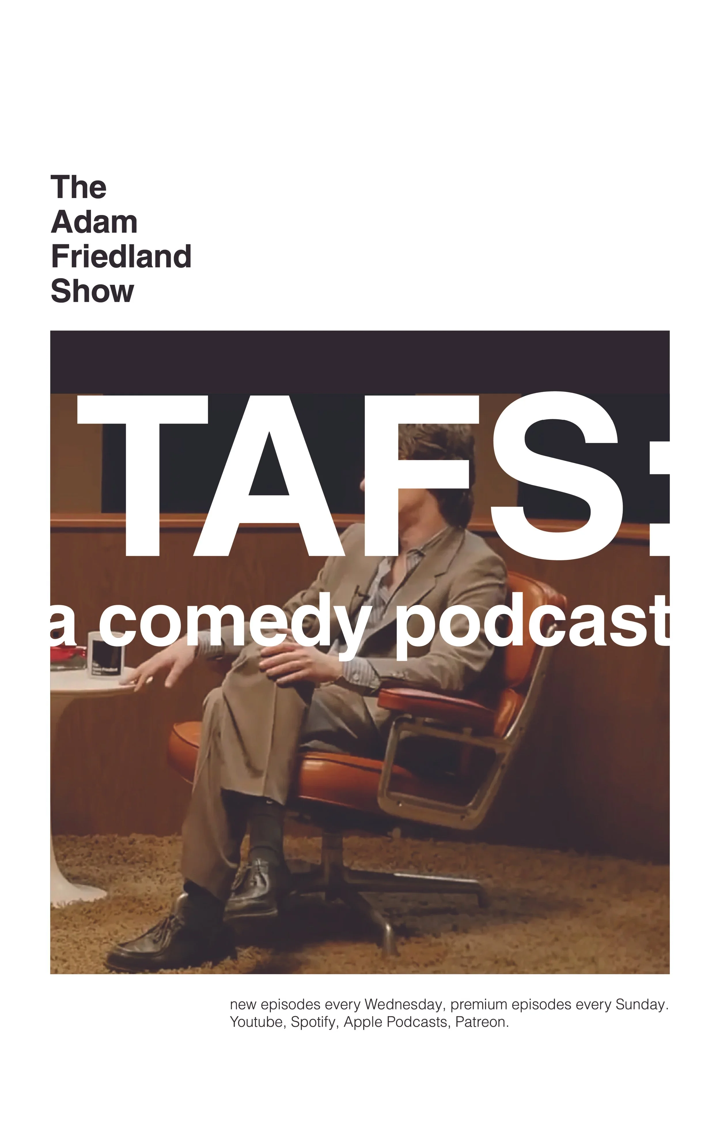
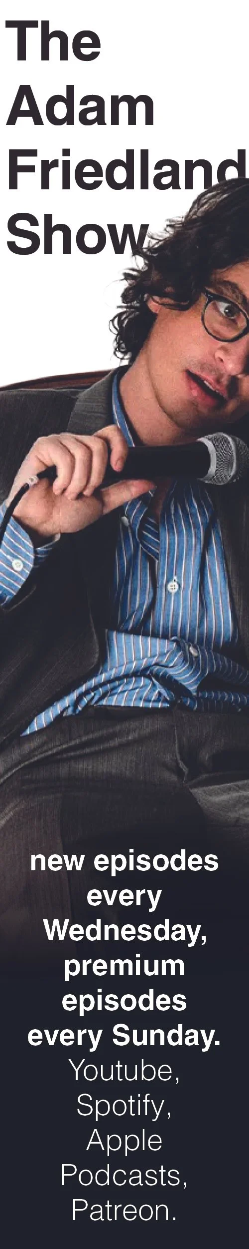
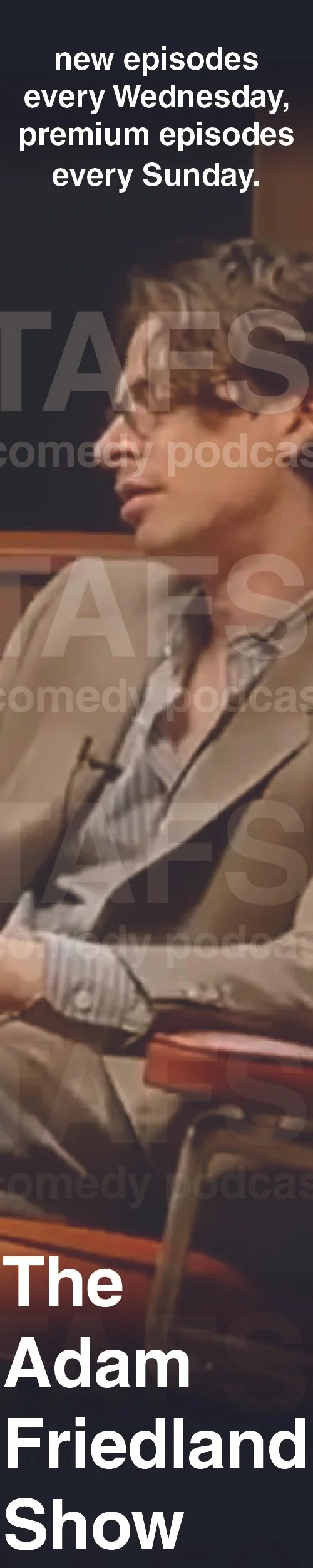
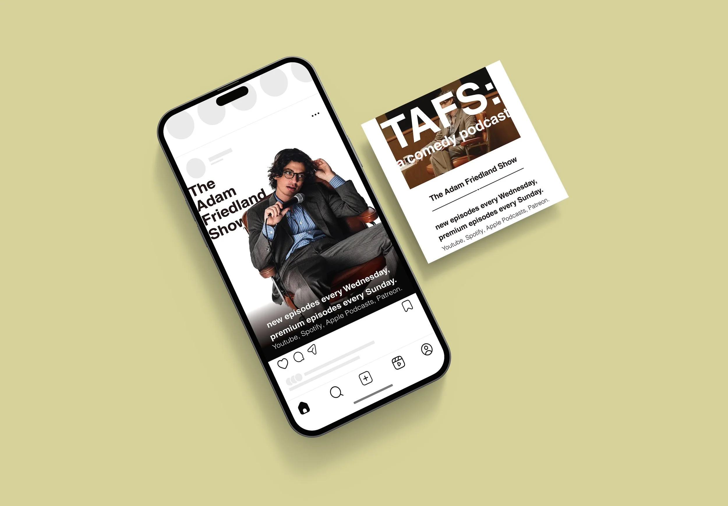
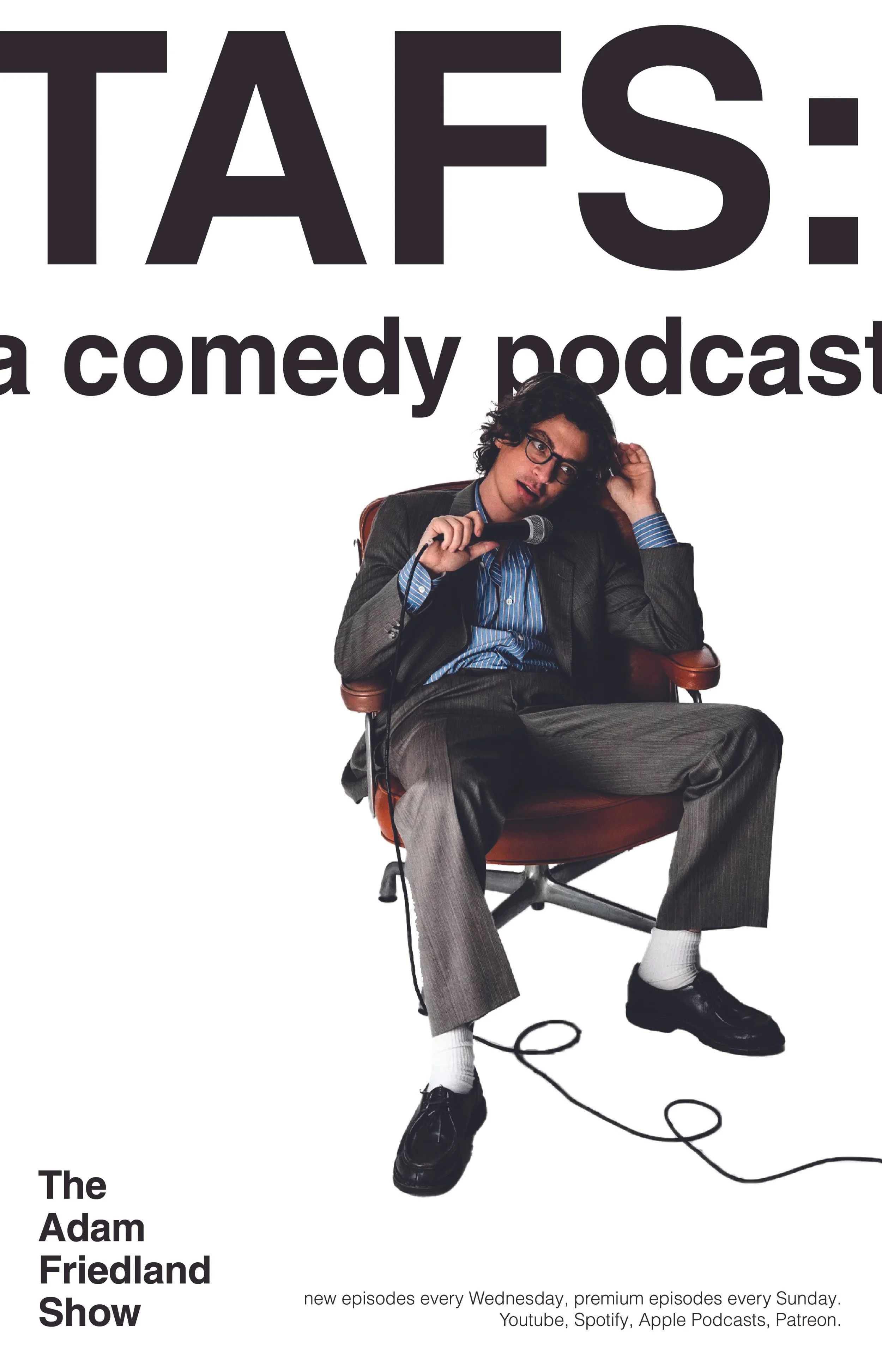
To create a series of virtual and print advertisements for an existing podcast. This includes posters, web skyscraper ads, and social media posts.
The Concept:
I chose The Adam Friedland Show, a podcast known for its boundary-less humor and willingness to sacrifice social appeal for a laugh. The show often brings in professional and serious guests with its professional aesthetic and set design, before presenting a questionable and, sometimes controversial, attitude and topics.
I wanted to capture that professional facade, while simultaneously implying the podcast’s ability to break rules and boundaries.
The Solution:
Using a basic, linear grid, I designed the ads like a legal document: Clean margins, white backgrounds, ink-like blacks. Then, like the podcast, I broke the boundaries with a gigantic, abbreviated title and simple description.